
Lovable UI Prompts: 14 Design Templates for Screens and States
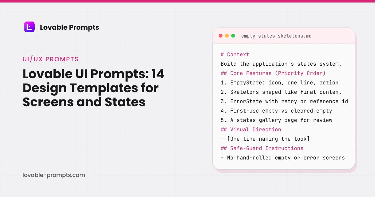
Most Lovable UI problems are not design problems. They are specification problems. Lovable produces a competent happy path from almost any prompt, then leaves out the empty state, the loading state, the error screen and the mobile breakpoint, because none of them were mentioned. The result looks right in a screenshot and breaks the first time a list is empty.
These fourteen prompts are the interface pieces that get skipped. Several exist only to force the states Lovable omits by default: Empty States & Loading Skeletons, Simple 404 & Error Screens, and the state handling inside Table UI with Sorting & Filters. Since 26 September 2026 every one of them also carries a Visual Direction line and a closing instruction that makes Lovable ask its questions before it builds, both taken from Lovable's own prompting documentation.
File Upload + Tagging UI
What this prompt is for
Upload UI that survives reality: drag-drop with previews, progress per file, tag management, and every failure state a network can produce.
When to use it
Any feature where users bring their own files. Uploads are the interaction most likely to fail mid-way, so the states matter more than the styling.
# Context
Build file upload with tagging: users drag files in, watch true per-file progress, and organize with tags that are managed values rather than free text. The unhappy paths are the feature; a demo-quality uploader breaks on the first flaky connection.

## Core Features (Priority Order)
1. Drag-drop zone with click-to-browse fallback and visible file-type and size rules
2. Per-file progress
Channel-Optimized Pro Version
This prompt has a Pro version optimized for Product-led Growth. Unlock to get product-channel fit guidance and distribution-ready features.
Analytics Dashboard UI
What this prompt is for
A dashboard that answers questions instead of displaying charts: every metric with a window, zero distinguished from unknown, and density with hierarchy.
When to use it
When users need to read state at a glance and act. If nobody makes decisions from it, it is decoration; instrument the decisions first.
# Context
Build an analytics dashboard for operators: headline metrics, one trend, one breakdown table, readable in five seconds and honest under failure. Every number answers 'compared to what, over when'.

## Core Features (Priority Order)
1. Four metric tiles, each stating its time window on the tile, with delta versus previous period
2. One time-series chart with range selector (7, 30, 90 days
Channel-Optimized Pro Version
This prompt has a Pro version optimized for Product-led Growth. Unlock to get product-channel fit guidance and distribution-ready features.
User Onboarding Flow UI
What this prompt is for
A multi-step onboarding flow with memory: progress persists, steps skip honestly, and each screen collects only what it immediately uses.
When to use it
When new users need setup before value, and only for the steps that genuinely gate value. Every screen you add is users you lose; earn each one.
# Context
Build a multi-step onboarding flow: a handful of screens that configure the product for a new user, with progress that survives interruption and questions that earn their place by visibly changing what comes next.

## Core Features (Priority Order)
1. Stepper UI: current position, step names, and back navigation that never loses answers
2. Progress persisted server-side per user; resume
Channel-Optimized Pro Version
This prompt has a Pro version optimized for Product-led Growth. Unlock to get product-channel fit guidance and distribution-ready features.
Poll Tool UI
What this prompt is for
Polls that stay trustworthy at the edges: one vote enforced, results honest about sample size, and a share loop that grows the sample.
When to use it
Quick sentiment from a group without the ceremony of a survey. For anything longer than one question, use a form; polls win on being instant.
# Context
Build a poll tool: create a single-question poll, share a link, collect one vote per person, and show results that are honest about how many voted. Instant to answer, hard to stuff.

## Core Features (Priority Order)
1. Poll creation: question, 2-6 options, open or scheduled close
2. A public voting page: tap an option, see results immediately after
3. One-vote enforcement per visitor, s
Channel-Optimized Pro Version
This prompt has a Pro version optimized for Organic Socials. Unlock to get product-channel fit guidance and distribution-ready features.
Location-Based Listings UI
What this prompt is for
A location directory built for both readers: humans get search, filters and a map-list pairing; crawlers get one indexable page per place.
When to use it
Directories of physical places or local services where 'near me' is the query shape. If locations lack unique attributes, a table beats this.
# Context
Build a location directory: browse and filter places on a paired map and list, with every place and every city owning a server-rendered, indexable URL. The interactive layer enhances pages; it must never replace them.

## Core Features (Priority Order)
1. A detail page per location at a stable URL: name, address, attributes, description
2. City index pages listing that city's locations,
Channel-Optimized Pro Version
This prompt has a Pro version optimized for Organic SEO. Unlock to get product-channel fit guidance and distribution-ready features.
Social Share Widgets
What this prompt is for
Share functionality that respects the platforms: correct metadata per target, native share on mobile, copy-link done right, and no tracking bloat.
When to use it
When users have something individually theirs to share: a result, an artifact, a page. Generic site-wide share buttons on everything share nothing.
# Context
Add sharing to content that is individually worth sharing: each shareable URL gets correct social metadata, mobile gets the native share sheet, desktop gets platform links and copy-link, and the whole thing weighs nearly nothing.

## Core Features (Priority Order)
1. Per-URL Open Graph and Twitter card metadata: title, description, image, rendered server-side
2. Native share sheet via th
Channel-Optimized Pro Version
This prompt has a Pro version optimized for Organic Socials. Unlock to get product-channel fit guidance and distribution-ready features.
SEO Meta Tag Generator UI
What this prompt is for
An internal tool that ends metadata guesswork: per-page titles and descriptions edited against live previews, with limits, warnings and export.
When to use it
When a site has enough pages that metadata lives in a spreadsheet nobody trusts. This turns it into a reviewed, exportable source of truth.
# Context
Build an internal SEO metadata editor: every page listed with its title and description, edited inline against a realistic search-result preview, validated for the errors that actually cost clicks, exportable to where the site reads it.

## Core Features (Priority Order)
1. A page list: URL, current title, current description, status flags
2. Inline editing with a live SERP-style preview
Channel-Optimized Pro Version
This prompt has a Pro version optimized for Organic SEO. Unlock to get product-channel fit guidance and distribution-ready features.
Responsive Navbar Builder
What this prompt is for
Site navigation done once and correctly: responsive collapse, keyboard and screen-reader complete, active states, and zero layout shift.
When to use it
First shell component of any multi-page app. Every later screen inherits it, so its quality is multiplied by the page count.
# Context
Build the site navigation shell: a responsive navbar that collapses to a menu on small screens, communicates location, and behaves perfectly for keyboard and screen-reader users. Every page inherits this; build it like it is load-bearing, because it is.

## Core Features (Priority Order)
1. Desktop bar: logo home link, five or fewer items, one primary action visually distinct
2. Mobile c
Channel-Optimized Pro Version
This prompt has a Pro version optimized for Product-led Growth. Unlock to get product-channel fit guidance and distribution-ready features.
Simple 404 & Error Screens
What this prompt is for
Error screens that recover the visit: honest status codes, useful next steps per error type, and search instead of a dead-end apology.
When to use it
Before launch, because links rot from day one. The 404 is the page you never promote that every site eventually shows.
# Context
Build the site's error surfaces: a 404 that recovers the visit, a generic error boundary that protects user work, and an offline state. These pages meet users at the worst moment; their quality is disproportionately remembered.

## Core Features (Priority Order)
1. 404 page: what happened in one line, search box, and links to the three most useful sections
2. Correct status codes: true 4
Channel-Optimized Pro Version
This prompt has a Pro version optimized for Product-led Growth. Unlock to get product-channel fit guidance and distribution-ready features.
Custom Footer & Header Templates
What this prompt is for
The page frame as a system: one header and footer pair, defined once, with slots for what varies, so the frame never forks across pages.
When to use it
At project start, before page three exists. Once headers fork per page, every later change is a hunt across files.
# Context
Build the page frame: one header component and one footer component used by every page, with clearly defined slots for the few things that vary. The footer is a working surface, not a copyright afterthought.

## Core Features (Priority Order)
1. Header: brand, primary nav slot, action slot, consistent height, server-rendered
2. Footer: grouped link columns (product, resources, company, l
Channel-Optimized Pro Version
This prompt has a Pro version optimized for Product-led Growth. Unlock to get product-channel fit guidance and distribution-ready features.
Settings & Preferences Panel UI
What this prompt is for
Settings that users can find their way around and trust: grouped sections, instant-save with confirmation, dangerous actions quarantined, every change reversible or warned.
When to use it
As soon as the product has more than five user-configurable values. Settings sprawl is easier prevented than reorganized.
# Context
Build the settings area: profile, preferences, notifications and account sections, navigable and predictable, where every change communicates its save state and destructive actions cannot be stumbled into.

## Core Features (Priority Order)
1. Sectioned layout: sidebar navigation on desktop, collapsible sections on mobile
2. Auto-save per control with visible saved-state confirmation, no
Channel-Optimized Pro Version
This prompt has a Pro version optimized for Product-led Growth. Unlock to get product-channel fit guidance and distribution-ready features.
Empty States & Loading Skeletons
What this prompt is for
The states system for the whole app: empty, loading, error and partial defined once as components, so every screen handles absence identically and helpfully.
When to use it
Immediately after the app shell, before feature screens multiply. This is the most consequential prompt in the category because every screen inherits it.
# Context
Build the application's states system: reusable empty, loading, error and partial-data components with clear rules for which appears when. Every list, form and detail screen will use these; they are the difference between an app that guides and one that shrugs.

## Core Features (Priority Order)
1. EmptyState component: icon slot, one-line explanation, primary action, sized variants
2. S
Channel-Optimized Pro Version
This prompt has a Pro version optimized for Product-led Growth. Unlock to get product-channel fit guidance and distribution-ready features.
Modal & Dialog Component System
What this prompt is for
One dialog system for the whole app: sizes, focus behavior and dismissal rules defined once, so confirmations and forms stop inventing their own physics.
When to use it
Before the third modal exists. Dialogs multiply, and each hand-rolled one forks focus and escape behavior a little differently.
# Context
Build the application's dialog system: modal and confirmation primitives with consistent sizes, focus management and dismissal semantics, used by every overlay in the app. One system, no per-feature dialog physics.

## Core Features (Priority Order)
1. Base modal: sm, md, lg sizes, header, body, footer slots, close affordance
2. Focus behavior: trap inside, initial focus on the safe acti
Channel-Optimized Pro Version
This prompt has a Pro version optimized for Product-led Growth. Unlock to get product-channel fit guidance and distribution-ready features.
Table UI with Sorting & Filters
What this prompt is for
A data table that stays fast and shareable: server-driven sort and filters in the URL, virtualized rows, and states for every way data disappoints.
When to use it
Any dataset past a hundred rows or a second consumer. Under that, a styled list with search beats the machinery.
# Context
Build a data table for production volumes: sorting, filtering and pagination driven server-side, the current view encoded in the URL, and rendering that stays smooth at ten thousand rows. Tables are where generated apps quietly collapse; this one is specified against that.

## Core Features (Priority Order)
1. Column sorting, single-column with direction, ascending and descending, indica
Channel-Optimized Pro Version
This prompt has a Pro version optimized for Product-led Growth. Unlock to get product-channel fit guidance and distribution-ready features.
Every Prompt, Every Kit, One Payment
All 14 prompts plus every Pro variant and build kit in one bundle, plus unlimited prompt generation, $199 once. Or sign up free to copy prompts one at a time.
Browse More Categories
Related Resources
The Complete Lovable Bundle
$199 once. Unlimited generation, every prompt, every kit, every future dropEvery prompt, every Pro variant, all four build kits and every future drop, in one Notion workspace. One payment, never a subscription.
Get the 151-Prompt BundleWhich growth channels do these prompts serve?
Every prompt in this category carries a distribution section naming the channel it is built for, so the generated app has a way of being found rather than only a feature set. The chart counts primary and secondary coverage together, computed from the prompt bodies when the site is built.
| Category | prompts |
|---|---|
| Product-led Growth | 11 |
| Organic SEO / AI Search | 6 |
| Organic Socials | 4 |
| Community-led Growth | 3 |
| B2B Sales / LinkedIn | 3 |
| Email Marketing | 3 |
Computed from the channel mapping in each prompt at build time; a prompt can serve more than one channel.
What is a Lovable UI prompt, and why do most of them produce a screenshot rather than an interface?
A Lovable UI prompt is a Build mode message that names the components, the states and the responsive behaviour of one part of an interface, plus the look it should have. Lovable's prompting best practices put it as building "in modular parts, not full pages at once", with each prompt "like building with Lego bricks" that has "one clear purpose and structure" (read on 26 September 2026). A prompt that says "a clean, modern dashboard" fails that test twice: it names no part, and it names no state.
The look is the half most people get right, because it is the half Lovable makes easy. Its design guidance shows three design directions for any UI request unless the prompt "already commits to a concrete visual direction", which it defines as prompts that "specify fonts, colors, or branding", reference another product, paste a URL to copy, or use a named design system. So the visual side either gets one committed line in the prompt or a side-by-side choice of three before anything is built.
The states are the half that gets skipped, and no picker exists for them. Lovable's own prompts ask for them by name where they matter: its dashboard prompt ends with "include loading and empty states", and its dark mode prompt asks that "every page, chart, and form looks right in both themes" (prompt library, read the same day). The fourteen prompts here take that habit to its conclusion: every list, form and detail screen gets its empty, loading, error and partial states specified, and one prompt exists only to define them once for the whole app.
How is a UI prompt in this library built?
Every UI prompt follows the same skeleton, and the most useful one to read is the states system, because every other screen in the category inherits it. Its sections, read from the prompt body rather than described from memory, are below. The two newest, Visual Direction and Before Building, were added on 26 September 2026 from the rules in Lovable's docs: a committed look skips the three-direction step, and a closing "ask me any questions" line is what the best-practices page recommends adding to any prompt that needs context.
- Context: The states system every screen will use, and why.
- Core Features (Priority Order): Empty, skeleton, error, first-use vs cleared, gallery.
- State Rules: Outage is not emptiness; skeletons keep the layout.
- Visual Direction: One line on the look, or let Lovable propose three.
- Build Order: Components first, gallery second, one live screen third.
- Safe-Guard Instructions: No hand-rolled states; no stack traces on screen.
- Before Building: Lovable asks its questions, then saves the answers.
Headings read from the prompt body of empty-states-skeletons in this library.
The State Rules section is where this prompt differs from a feature request. "Zero data and failed-to-load are never the same screen" is a rule about honesty, not styling: an app that renders an outage as an empty list hides the outage. "Skeletons match final layout dimensions" is a rule about layout shift. Neither is something Lovable will infer from "add loading states", which is why the prompt spells them out and then asks for a gallery page that renders every variant so the rules can be checked by eye.
What happened when we ran the states prompt in Lovable?
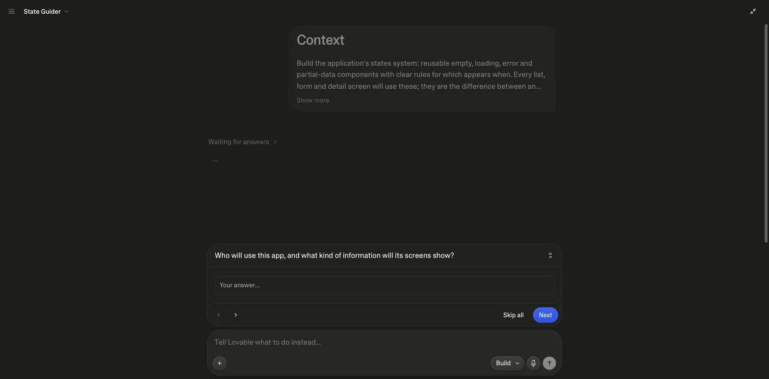
On 26 September 2026 we pasted the Empty States & Loading Skeletons prompt into a fresh project in Marco's own Lovable workspace, in Build mode, with the Visual Direction line removed as the prompt itself suggests. Before building anything, Lovable asked two questions, exactly as the Before Building line requests: who will use the app and what its screens show, and which screen should receive the states system first. We answered with a small team task tracker and chose its offer to create a representative screen. It then enabled Lovable Cloud for task data and sign-in, built the four base components, a gallery at /states and a working task-list screen, and reported that it had verified creation, completion, slow loading, failure and retry before removing its test data.
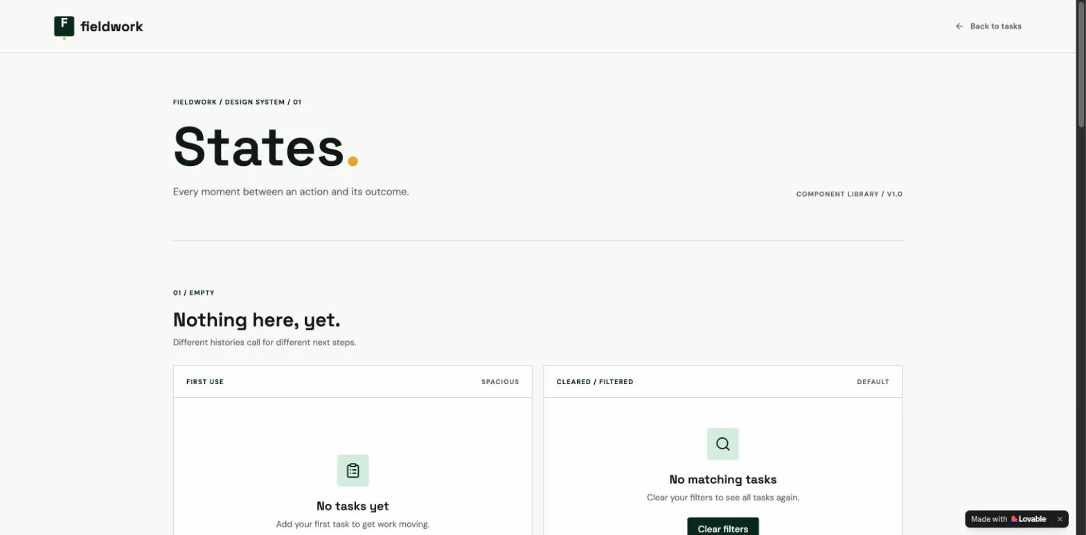
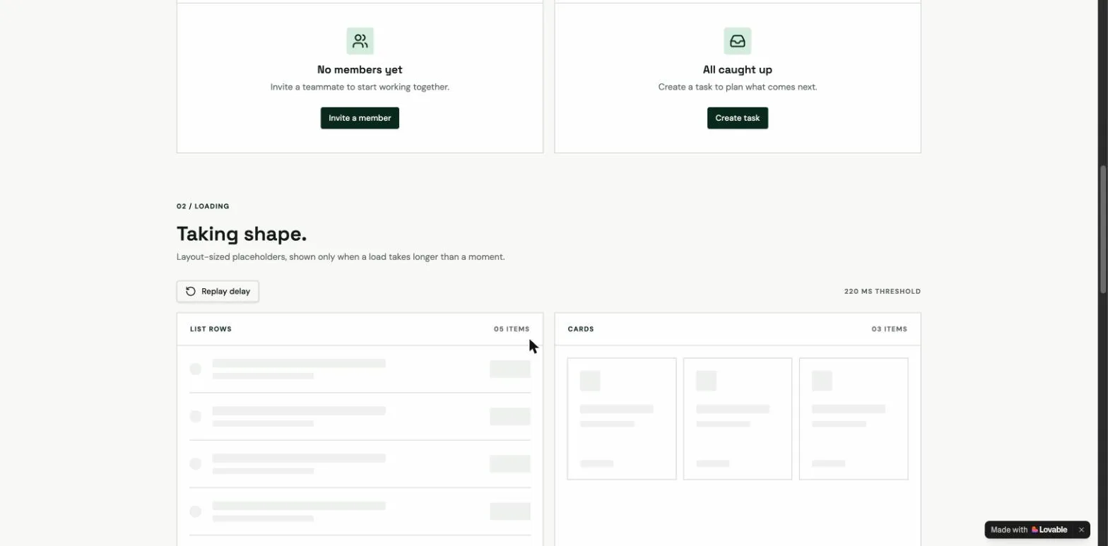
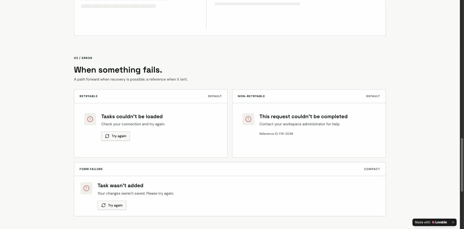
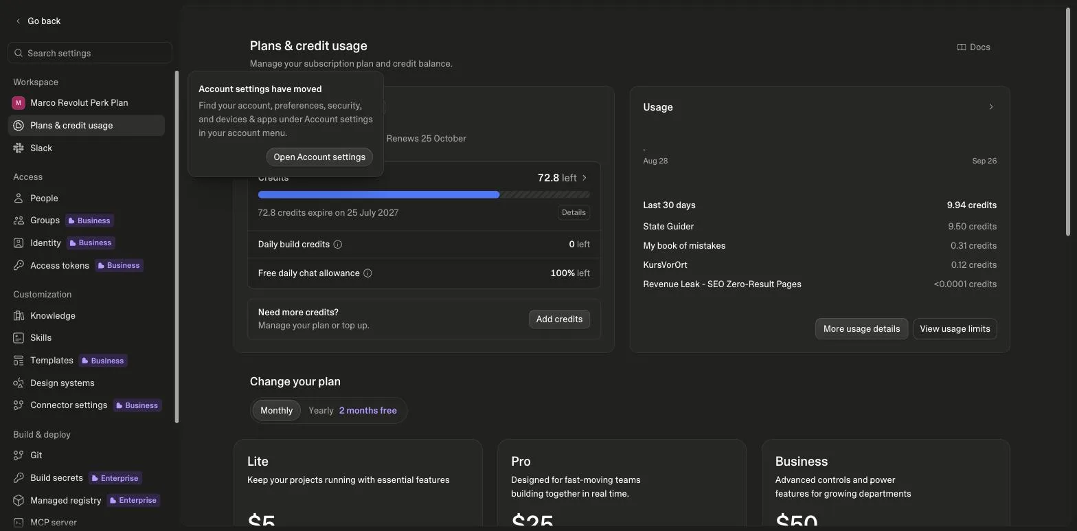
The gallery is the artifact. It renders first-use and cleared empties as separate cards, skeletons sized like the list rows and cards they replace with a stated 220 ms delay threshold and a replay control, retryable and non-retryable errors with a reference id on the second, a compact form failure, and a partial-data notice that keeps the rows that arrived. Every one of those is a line in the prompt's State Rules. Cost, read from the workspace's credit page before and after: the balance went from 77.3 to 72.8 credits and the 5 daily build credits were used first, so the whole run, Cloud provisioning and sign-in included, was 9.5 credits. That is the honest number to plan with for a system-level prompt, against 1.8 for the single landing page we ran in July.
How do these prompts differ from Lovable's own design prompts?
Lovable's prompt library opens with a "Design and style" section: six one-sentence prompts that each set a look (minimal, premium and glassmorphic, bold, playful, calm, editorial), plus "Show me three options for the hero section" and "Use the logo and color palette from @BrandSite". Its minimal prompt reads, in full: "Design the note-taking app with radical minimalism: a pure white background, a single centered column, neutral tones, no visual clutter, and soft, quiet transitions." That is a good visual brief, and it is exactly the kind of line the Visual Direction slot in each prompt here is for.
| Lovable's Design and style prompts | UI prompts in this library | |
|---|---|---|
| What it specifies | The look: palette, tone, spacing, transitions | The parts and their states, with a one-line slot for the look |
| Length | One sentence | About 250 words with numbered features and rules |
| States | Only where a feature prompt mentions them | Empty, loading, error and partial named per screen |
| Accessibility | Not covered | Focus, aria and keyboard rules in the shell prompts |
| Design directions step | Skipped, because the look is committed | Runs unless you fill the Visual Direction line |
| Best for | Restyling an app that already works | Building the shell, the states and the data screens once |
Use both. Paste one of Lovable's look sentences into the Visual Direction line of a prompt from this page, and you get the committed direction that skips the three-way picker plus the states, the accessibility rules and the build order that the look prompt does not carry. The library page also says to save the chosen direction to the project knowledge so "every later prompt builds on them automatically", which is what the Before Building line asks Lovable to do.
How does Lovable's design direction step work with these prompts?
If a prompt from this page goes in with the Visual Direction line left out, Lovable runs its design guidance flow before building. The steps, as its documentation describes them, are the flow below; the refine step allows at most six rounds, and the chosen direction is then locked in for the project. Fill the line with one committed sentence and the flow is skipped, which is the faster path once you know the look you want.
- Describe project: the UI prompt itself
- Compare three: side by side or fullscreen
- Refine one: up to six rounds
- Submit direction: locked for the project
- Build: states and screens follow
Steps from Lovable's design guidance documentation, read on 26 September 2026. Refinement is capped at six rounds per the same page.
Either path is fine. What matters is that the look is decided once, saved to the project knowledge, and never restated in the prompts that follow. The design systems feature is the heavier version of the same idea: a dedicated project holding components, tokens and setup instructions that other projects connect to, one design system per project, React component libraries only.
Which UI/UX prompts do builders upvote most?
Every card on this page carries an upvote, one per visitor, and the cards are sorted by it. The counts below are read from the database when the page is rendered and refresh hourly, so they can lag a card by a vote or two. They are the first thing we look at when deciding which prompt in a category to extend.
| Category | upvotes |
|---|---|
| File Upload + Tagging UI | 18 |
| Analytics Dashboard UI | 6 |
| Social Share Widgets | 3 |
| Responsive Navbar Builder | 2 |
| User Onboarding Flow UI | 1 |
| SEO Meta Tag Generator UI | 1 |
Upvotes recorded on lovable-prompts.com since January 2026 for this category, 36 in total, one vote per visitor. Read from the database at render time.
Which UI prompt to use
If you are building the shell of an app, start with Responsive Navbar Builder and Custom Footer & Header Templates, then Settings & Preferences Panel UI. Those three cover the frame that every other screen sits inside, and getting them right once saves repeating the breakpoint work per page.
If you are displaying data, Analytics Dashboard UI and Table UI with Sorting & Filters are the two that matter, and the table prompt is the one to reach for when the dataset is large enough that virtual scrolling and URL-persisted filter state stop being optional.
If users have to do something multi-step, User Onboarding Flow UI and Modal & Dialog Component System handle the sequencing and the interruptions. File Upload + Tagging UI covers the case Lovable most often gets partially right, and it is the third most upvoted prompt in the whole library.
Suggested build order
The frame first, then the states, then the specific screens. Doing it in the reverse order means every screen invents its own loading treatment. Lovable's idea-to-app guide makes the same point from the other side: set the design direction early, because design problems are harder to fix later than to decide up front.
Build the frame
Navigation and breakpoints once, not per page.
Prompt: Responsive Navbar Builder
Define the states before the screens
Empty, loading and error as a system. This is the single most consequential prompt in the category, because it changes every screen that follows.
Prompt: Empty States & Loading Skeletons
Add the interruption pattern
One dialog system, so confirmations and forms do not each get their own.
Prompt: Modal & Dialog Component System
Then the data-heavy screens
Tables and dashboards inherit the states and the frame rather than redefining them.
Prompt: Table UI with Sorting & Filters
Where UI prompts usually go wrong
- Describing the aesthetic instead of the components. Lovable responds to named shadcn/ui components, spacing values and breakpoints. Words like sleek, minimal or premium only work inside a committed visual sentence of the kind Lovable's own library uses, where they sit next to a palette, a layout and a transition rule.
- Prompting screen by screen. Each screen then gets its own loading spinner, its own empty message and its own idea of what 8px means. Specify the system once and reference it. Lovable's best-practices page says the same about change prompts: name what to build, where it goes, and what must stay untouched.
- Forgetting the state where there is no data. It is the first thing a new user sees and the last thing anyone prompts for.
- Skipping the questions. A prompt this detailed has context Lovable cannot see, such as who the users are and what the screens hold. The Before Building line exists so it asks before spending credits, and in our run it asked exactly that.
Frequently asked
Can Lovable build a full UI from one prompt?↓
It can build one screen well from one prompt. A full interface needs the frame, the shared states and the individual screens specified separately, which is why this category is sequenced rather than listed. Asking for an entire app UI in a single prompt reliably produces a good first screen and thin ones after it.
Does Lovable show design options before it builds?↓
Yes, by default. Lovable's design guidance shows three design directions for a UI request unless the prompt already commits to a visual direction by naming fonts, colours or branding, referencing another product or URL, or using a named design system. Every prompt here has a Visual Direction line: fill it to skip the step, or leave it out to pick from three.
Do these prompts assume shadcn/ui?↓
Yes. They name specific shadcn/ui components because that is what Lovable scaffolds with by default, and naming components rather than describing them is the difference between a design instruction the model can act on and one it cannot.
What about dark mode and accessibility?↓
Both are specified in the prompts rather than left to a follow-up. The navbar and dialog prompts carry focus, aria and keyboard rules; Lovable's own library has a one-sentence dark mode prompt that asks every page, chart and form to look right in both themes, which pairs well with the states prompt here. Retrofitting either is more work than asking up front, because both affect component choice.
Can I use a Lovable design system with these prompts?↓
Yes. In Lovable a design system is a dedicated project holding a React component library, a token schema and setup instructions, connected to other projects in the workspace, at most one per project. Connecting one counts as a committed visual direction, so the three-direction step is skipped and the prompts here supply the states and behaviour on top of it.
Can I use these for design mockups rather than working code?↓
Lovable generates working React, not static mockups, so these produce interfaces you can click through. That is usually more useful than a mockup for validating a flow, since the states behave rather than being drawn.
Related reading
- the states prompt, run with screenshots
A gallery of empties, skeletons and errors.
- app builder prompts
The apps these screens sit inside.
- landing page prompts
One offer, one action, one traffic source.
- the admin dashboard kit
Aggregates that respect row-level security.
- how to write prompts for Lovable
The skeleton every prompt here follows.
- advanced prompting: Skills, goals and chains
Refinement prompts that keep the frame intact.
- common Lovable mistakes
Skipping states is number three.
- Lovable vs Cursor
Not the same category.
- first 100 users
Share moments only matter with a channel.
- a Tailwind and shadcn rule for Cursor
Four states per screen, as a rule.
- Lovable mobile app
Shipping a Lovable app to a phone: PWA or wrapper.
- MVP examples
The states gallery as an MVP example, priced.
- prompt engineering examples
The visual direction slot as a before-and-after pair.
Sources
All checked on 26 September 2026.
Updated .
Written by

Marco Kohns
Founder of ProtoBites - Venture Growth Studio
Growth PM at a Silicon Valley scale-up (a16z and General Catalyst backed), ex-Techstars where he consulted 13 early-stage startups, Reforge-trained. Every prompt on this site comes out of shipping ProtoBites' own portfolio products.
Help shape this product
We're building this in public and your input genuinely matters.
If something felt confusing, missing, or especially useful, I'd love to hear about it. It takes ~30 seconds and helps me improve the parts that matter most.
Share quick feedbackGoes straight to the builder. No marketing questions. No auto-replies.